The Value of a Well-Designed Logo
You have one chance to make a first impression. Potential customers will form an opinion of a business within seconds. A company's logo is therefore extremely influential, as it is almost always the first thing a customer will see. In addition, once a customer becomes familiar with a business, the company's logo will always be associated with that company name, and in turn, the company name will be associated with the logo. For these reasons, a considerable amount of thought should go into choosing a logo.
Keep it Simple.
A logo should be simple, recognizable, and effective at conveying the desired message to the public. Each aspect of a logo's design should be carefully analyzed to ensure that it does in fact communicate the right message. The logo's colors, style, size, shape, font (if it is a logotype), and overall design each play a part in the logo's overall design, and are all important components to consider when creating an effective logo.
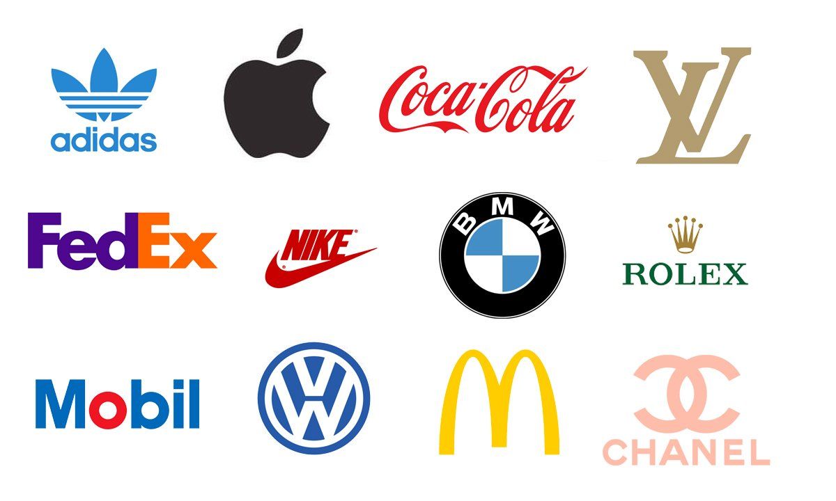
Color is immensely important, as color has a dramatic effect on an individual's reaction to almost anything. Restaurants not only carefully choose the colors of their logos, but also carefully select the colors of the restaurant interior. In their case, color affects how appetizing a potential customer views their restaurant, and in turn can have a dramatic affect on the amount of business they receive. The colors of the logo or restaurant can be the reason a hungry customer chooses one establishment over another. Financial businesses and banks tend to choose strong conservative colors such as darker blues and reds, to convey stability, trust and success. In some cases, a particular color itself often becomes associated with a business. As the background for their logo, UPS has used the color brown, which is now generally associated with their company. Since the color brown communicates stability, they have been able to use the association as a way of conveying a message of reliability to their customers.
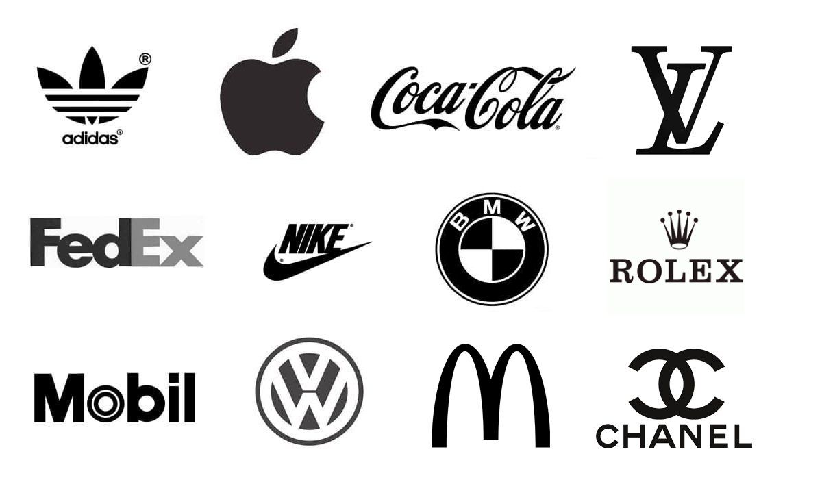
Always keep in mind that
colors have meaning and every element of your logo should serve a purpose. One test we use to determine if the logo is effective is to see what it looks like with only one color. Black especially. A company's logo is not just going on marketing materials and advertisements, the logo might be embroidered on clothing or hats. It will be used as an icon for mobile devices and of course the favicon which is the tiny version of the logo displayed in browsers. Below are the same logos above but in black. You can see how they are just as effective.
In addition to color, the general style of a logo will determine the overall feeling conveyed to the public. The logo's style will determine whether people will view the business as conservative or trendy, casual or formal, expensive or low-priced, friendly or exclusive, etc. If a logo includes the actual company name, the font type used in the logo is part of its style as well, and will therefore also come into play by affecting an individual's overall response to the logo.
Size is also important to consider. A logo will be used in large-scale settings such as advertisements, store-fronts and billboards, but will also be used for small-scale needs like email communication, websites, business cards and corporate stationery. A logo should be designed so that it will be effective and recognizable regardless its size.
If you have any questions about the logo design process and what to expect for costs you can contact us here at Clover Creative Group.
Media Contact
Company Name: Clover Creative Group LLC
Contact Person: Shawn Dixon
Email: Send Email
Phone: 603-677-7032
Address: 234 Camp Rd.
City: Plainfield
State: New Hampshire
Country: United States
Website: clovercreativegroup.com
Did you find this article helpful? Please consider sharing.